keyAI

Brand Identity
Guidelines

Logo, type, colour, imagery, patterns and applications — from one mark.Version 1.2 · October 2026

Contents

Each page answers one question about using the keyAI identity. Page numbers match the counter at the bottom of the screen.

Brand idea

Product
The AI operating system for your company
Promise
AI departments do the work. Your team approves everything that goes out.
Name
Always “keyAI”: lower-case k, capital A and I, one word.

Two halves of one spark. The work, and the person who approves it.

The mark is two quarters of a four-point spark, set apart and offset. Nothing about it is ornamental: every crop and layout in this book is cut from those two shapes.

That is how we read the mark, not a rule printed on it. It gives the identity one job — show work moving to a person, and stopping there until that person says yes.

02

Voice

keyAI speaks like a calm chief of staff: what was done, what is waiting for a person, what happens next.

Verbal
identity

keyAI speaks like a calm chief of staff: what was done, what is waiting for a person, what happens next. Short sentences, the verb first, no hype. Korean and English say the same thing, not the same words.

Voice
A calm chief of staff
We · you
“We” is Keynexion, “your team” is the customer
Source
The landing copy and its Korean glossary

Clear, not clever.

Say

Three drafts are waiting for your approval.

Not

Your AI magic is ready!

Exact, not hyped.

Say

The first department is marketing. Sales is next.

Not

Revolutionary AI that replaces your team.

Calm, not cold.

Say

Nothing goes out until you approve it.

Not

Fully autonomous. No humans needed.

We use

approve · draft · AI department · request changes · approval queue · weekly report

We avoid

magic · revolutionary · seamless · fully autonomous · replaces your team · 10×

Messaging

Five layers, read top to bottom. Layers 1–3 are fixed wording in both languages. Layers 4–5 change with the audience but use only facts we can show.

Tagline
AI works. People approve.
Headlines
Eight words or fewer
Numbers
Only measured ones, with the date they were measured
  1. 01 · Positioning

    The AI operating system for your company.

  2. 02 · Tagline

    AI works. People approve.

  3. 03 · Promise

    AI departments do the work. Your team approves everything that goes out.

  4. 04 · Proof

    First department: marketing. Built in Seoul. Judged by revenue and profit.

  5. 05 · Action

    Start with one department. Book a call

Primary
logo

The spark and the word “keyAI” together. This is the logo for every first impression: site header, documents, decks and signage. The pair is fixed; do not rebuild it.

Word
Host Grotesk Semibold 600, tracking −3.5 %
Spark
1.4 × the type size, centred on the line
Gap
½x from the spark to the k (x = cap height), 0.35 × the type size
Source
ai.keynexion.io header; gap tightened in 1.2
keyAI
keyAI

Colourways

The logo is one colour at a time: ink or white. Mint carries the logo only on the two mint grounds. On photographs, use white over the darkest calm area, with a 35 % black scrim if needed.
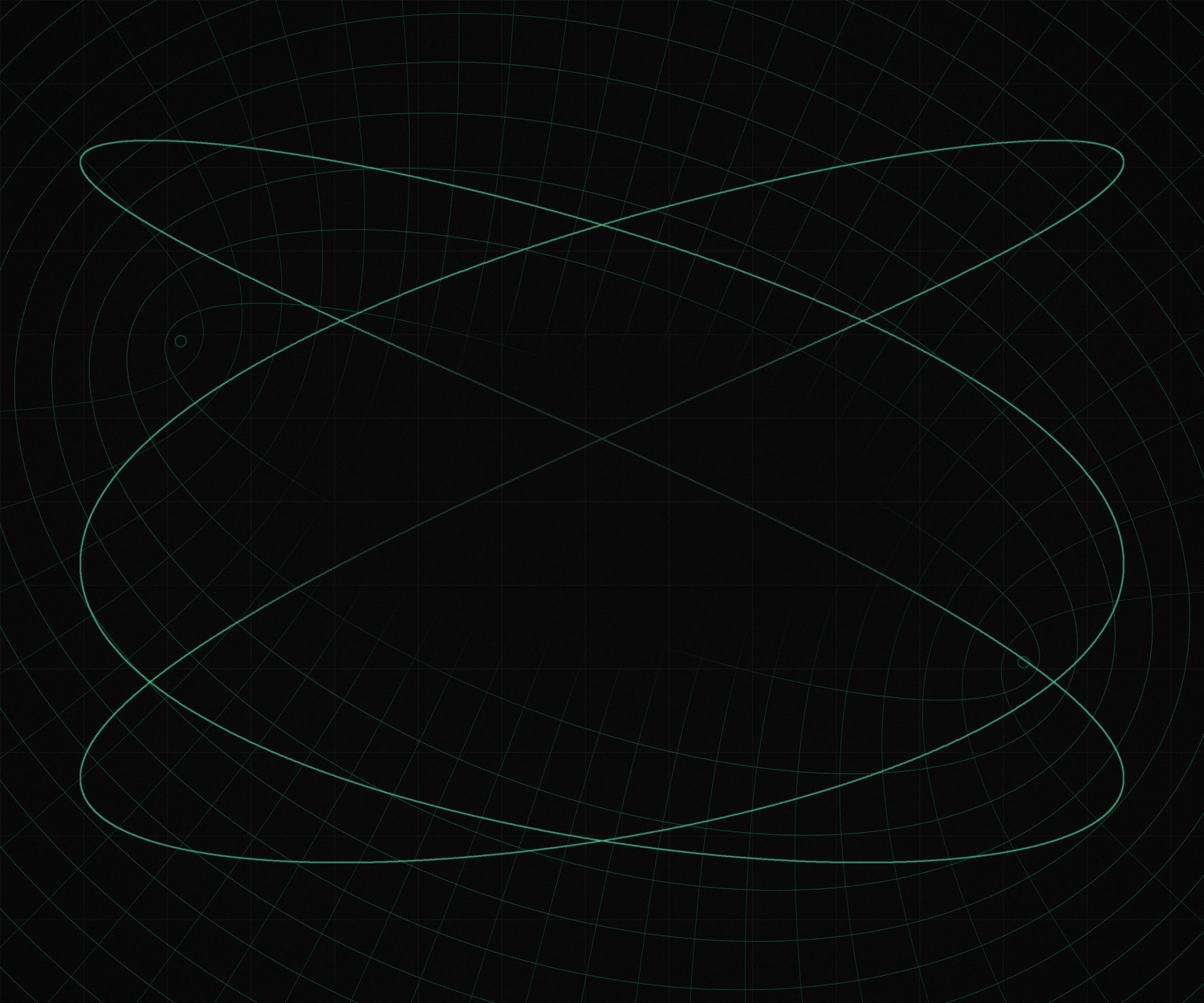
Contrast
At least 4.5 : 1 between logo and ground
Photo
White only, calm area, scrim ≤ 35 %
keyAI
keyAI
keyAI
keyAI
keyAI
keyAI

Construction

Turn one quarter four times round its corner and you get a four-point spark. The mark keeps two opposite quarters from two such sparks, offset so the halves slide past each other. The shape is point-symmetric.

Unit q
184 — one quarter’s side, 47 % of the mark height
Offset
Centre 2 sits 35.4 left and 21.5 down from centre 1
Symmetry
180° about (272, 270)
Measured
From the master artwork, 540-unit grid

Clear
space

x is the cap height of “keyAI”. The spark sits ½x from the k, and 1x stays clear on every side of the lockup; the mark alone keeps ½ of its height. No text, edge, image detail or other logo enters that zone.

Gap
½x, spark tip to the stem of the k (0.35 × type size)
Lockup
1x on all sides (0.70 × type size)
Mark
½ × mark height on all sides
Exception
App icons and favicons follow the platform grid
keyAI 1x1x
½½

Minimum
size

Below these sizes the gap between the halves closes and “keyAI” loses its capitals. Use the mark alone when the lockup would be smaller than its minimum.

Lockup
64 px wide on screen · 18 mm in print
Mark
16 px on screen · 5 mm in print
Live uses
Site header 80 px · favicon 16 px
keyAI

64 pxMinimum lockup

keyAI

80 pxSite header

keyAI

160 pxDocuments, decks

16 pxMinimum mark · favicon

32 pxAvatars, tabs

64 pxApp icon, mark at 58 %

Logo
usage

The logo either leads or signs. As the lead it is the largest thing on the surface; as a signature it sits small under a headline, in the bottom-left corner. It is never the same size as the type next to it.

① Lead
Lockup at least ⅓ of the surface width; nothing else larger
② Signature
Cap height at most ½ of the headline cap height; bottom left on the margin
Never
Logo and headline at the same size
①keyAI
②

AI works.
People approve.

keyAI

Co-branding

With a partner, the two logos share one line, split by a hairline. keyAI comes first. The space either side of the line is 1x, and the partner logo is never taller than the spark.

Unit
x = cap height of “keyAI”
Space
1x either side of the hairline
Hairline
1 px, as tall as the spark, 50 % of the logo colour
Partner
No taller than the spark; centred by eye, not by box
keyAIPartner logo
keyAIPartner logo

Misuse

The logo is supplied as artwork. Never redraw, edit or decorate it. If a layout seems to need one of these changes, change the layout instead.

Also never
Use the logo in another company’s name or product, or imply an endorsement keyAI has not given.
keyAI

Don’t stretch or squash

keyAI

Don’t rotate

keyAI

Don’t recolour

keyAI

Don’t outline

keyAI

Don’t rearrange

KeyAi

Don’t retype or recase

keyAI

Don’t move the halves

keyAI

Don’t use low contrast

In use

Dark ground, one clear subject, the white logo in the quiet corner.

keyAI

Logo
mark

The spark on its own. Use it where the name is already present or space is square: app icon, favicon, avatar, stamp, pattern. Four colourways only.

Proportion
331 × 390 (width × height, master units)
Colours
Ink, white, mint 600 on soft, glow 300 on deep
Files
assets/spark.svg, spark-mark.svg · master PNG 540 px

Logo
versions

One logo, six versions, chosen by the space available. Use the largest version that fits. Never build a new one; ask for it.

Order
Primary → Stacked → Wordmark → Mark → App icon → Favicon
Files
keyai-logo-<version>-<colour>.svg, e.g. keyai-logo-primary-ink.svg
Status
App icon is proposal C; it ships only if C is picked
keyAI

01 PrimaryHeaders, documents, decks, signage · min 64 px

02 StackedSquare spaces, posters, garment fronts · min 72 px

03 WordmarkWhen the spark is already near: footers, legal lines · min 56 px

04 MarkAvatars, patterns, stamps · min 16 px

05 App iconApp icon, store listing · proposal C · min 32 px

06 FaviconBrowser tabs · 16 and 32 px, mark only, pixel-checked

04

Colour

Black and white do the work. Mint is the one accent, and it means one thing: a person approved.

Colour
palette

Black and white do the work. Mint is the one accent and it means one thing: a person approved. Stripe widths show how much of a layout each colour should take.

Neutrals
Grey only, never cream or warm white
Accent
One mint element per layout
30 %White#FFFFFF
RGB 255 255 255
OKLCH 100 % 0
22 %Paper#F3F3F3
RGB 243 243 243
OKLCH 96.4 % 0
30 %Ink#111111
RGB 17 17 17
OKLCH 17.8 % 0
10 %Mint#087D53
RGB 8 125 83
OKLCH 52 % .114
8 %Glow#45D39C
RGB 69 211 156
OKLCH 78 % .145

Colour scale
and contrast

Ten mint steps for charts and states. Steps 100, 300, 600 and 900 are the site tokens; the rest are interpolated in OKLCH. Text pairs below are measured WCAG 2 contrast ratios.

Text on white
Mint 600 or darker (≥ 5.2)
Text on black
Mint 300 or lighter (≥ 10.4)
Source
scripts/tokens.mjs
50#EFFBF6
100#DCF5EA
200#9BE8C6
300#45D39C
400#2DB782
500#159B6A
600#087D53
700#0B5F40
800#11422F
900#10291F

● marks a step that is a live site token.

AaInk on white
18.9 · AAA
AaWhite on black
19.8 · AAA
AaMute on paper
5.8 · AA
AaMute on black
7.1 · AAA
AaMint on white
5.2 · AA
AaWhite on mint
5.2 · AA
AaGlow on black
10.4 · AAA
AaMint on mint 100
4.5 · AA

Colour
in type

Text is ink on light grounds and white on dark ones. One word may be lit: glow on black, mint on white. Never a bright colour on a bright ground or a dark one on a dark ground.

Body
At least 4.5 : 1; headlines at least 3 : 1
Highlight
One word or phrase per layout
Glow
Only on black or deep green, never on white (1.9 : 1)

AI works. People approve.

AI works. People approve.

AI works. People approve.

AI works. People approve.

AI works. People approve.

AI works. People approve.

AI works. People approve.

Don’t set glow on white

AI works. People approve.

Don’t set mint on black

AI works. People approve.

Don’t light two phrases

AI WORKS. PEOPLE APPROVE.

Don’t use all caps

05

Typography

Host Grotesk sets the logo word, headlines and interface. Few sizes, far apart; sentence case always.

Primary
typeface

Host Grotesk sets the logo word, headlines and interface. It is a contemporary grotesk with open counters; at display sizes set it tight, never in italics.

Family
Host Grotesk, variable 300–800
Display
Medium 500, tracking −3.5 %
Korean
Pretendard Variable beside it

Host
Grotesk

LightRegularMediumSemiboldBold

ABCDEFGHIJKLMNOPQRSTUVWXYZ
abcdefghijklmnopqrstuvwxyz
0123456789 (&@?!) → ·

Supporting
typefaces

Three companions with one job each. Newsreader for long reading leads, Fragment Mono for data and receipts, Pretendard for Korean. None of them is used for headlines in English.

Never
Mono as a heading label · serif italics

Drafts wait for a person.

NewsreaderLeads and statements · 21 px

APPROVED 09:12 marketing/post-02
CHECKS voice ✓ rules ✓

Fragment MonoTimestamps, IDs, status · 13 px

모든 결과물은
사람이 승인합니다

PretendardKorean text · keep-all wrapping

Type
hierarchy

Seven steps cover every layout. Each step is at least 1.2 × the one below, so hierarchy reads from size, not colour or weight alone. Values are the live site’s scale.

Scale
13 · 15 · 17 · 21 · 28 · 44 · 96 px
Line height
Display 1.0 · headings 1.1 · body 1.55
Display96 px · 500 · −3.5 %
Heading 244 px · 500 · −3.5 %
Heading 328 px · 500 · −3 %
Lead in Newsreader21 px · 400 · 0
Body text for paragraphs17 px · 400 · 0
Small text and captions15 px · 400 · 0
DATA 09:12 · B0113 px · mono · 0

Expressive and
recessive type

Type is loud or quiet, never in between. Expressive: one short line very large, the rest small. Recessive: a calm headline and body for product screens and long pages.

Expressive
Six words or fewer; cap height at least 4 × the body
Recessive
Headline 2–3 × the body; one body size
Case
Sentence case; no all caps
Align
Left by default; centre only a single short line

AI works.
People approve.

AI departments do the work. Your team approves everything that goes out.

The AI operating system for your company.

AI departments do the work. Your team approves everything that goes out. Start with one department.

keyAI

06

Imagery and motion

Liquid light under glass, and mathematical lines drawn from the mark. Motion explains, it does not decorate.

Brand
imagery

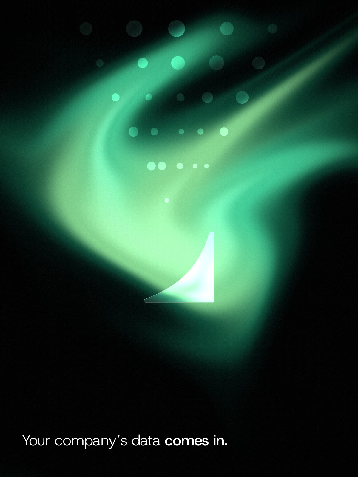
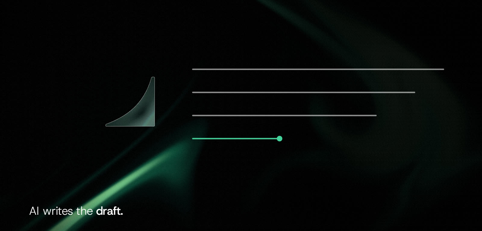
Liquid light under glass. The light is the work moving through the company; the glass is the spark, two halves that bend it: the AI’s work and the person who approves it. Each picture shows one step in one line of text. No people, no props.
Light
Ink, deep green, emerald, mint; aqua and pale lime only at the bright edges; fine grain
Never
Faces, hands, props, robots, purple-blue AI gradients, a second accent colour
Rule
One picture, one step, one thin line of text; glass only in the spark’s shapes
Glass beads of light stream down into one glass half of the keyAI spark over flowing mint light. Words: Your company’s data comes in.
One glass half of the spark; to its right, lines of light being written, the last one mint. Words: AI writes the draft.
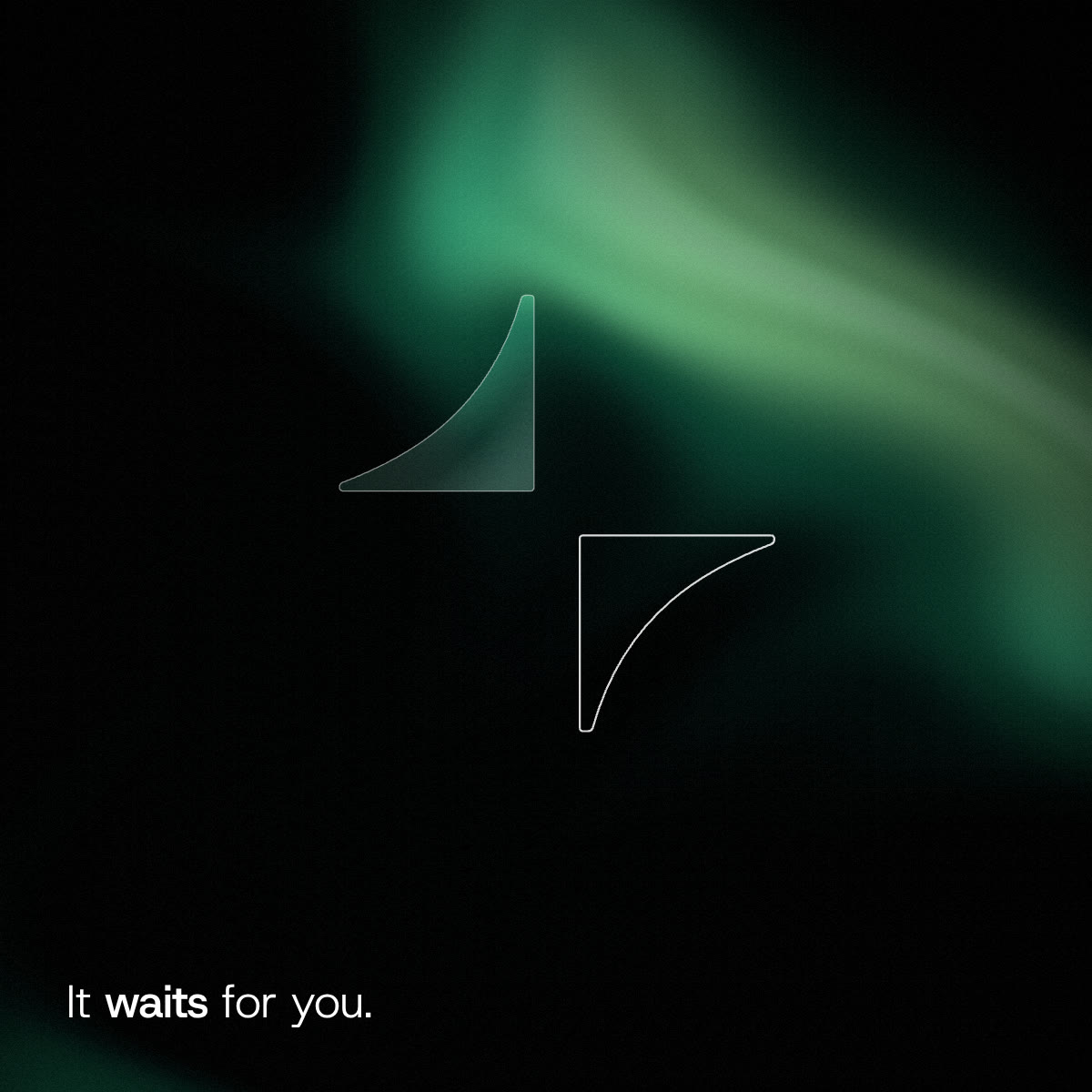
One glass half of the spark and the outline of the other half, apart. Words: It waits for you.
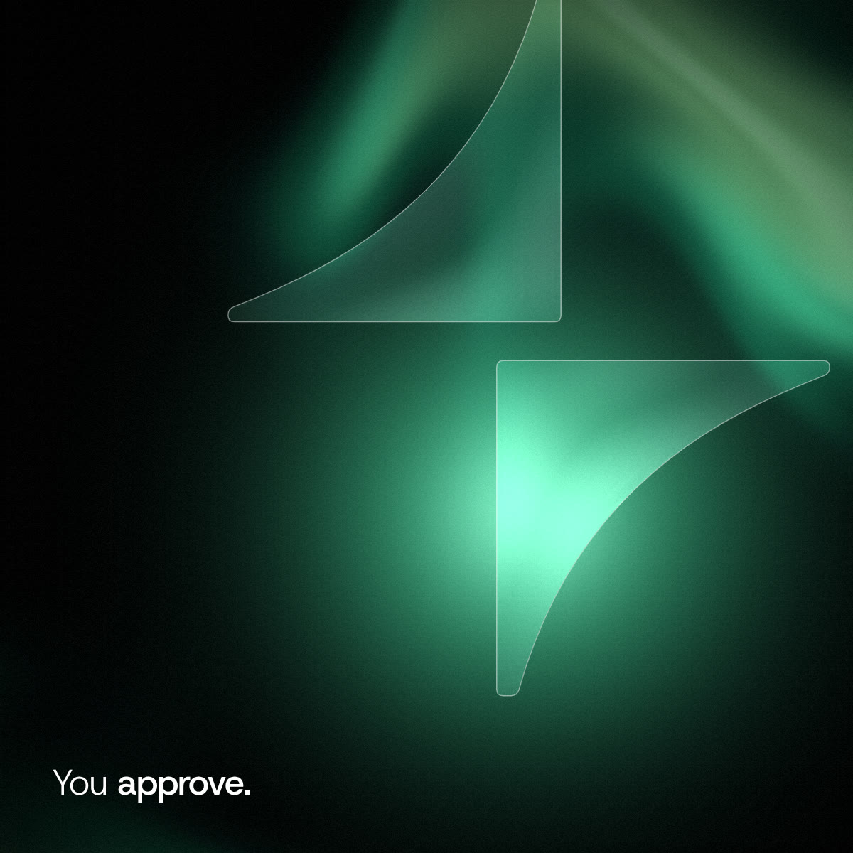
The two glass halves locked into the spark, light flaring at the join. Words: You approve.
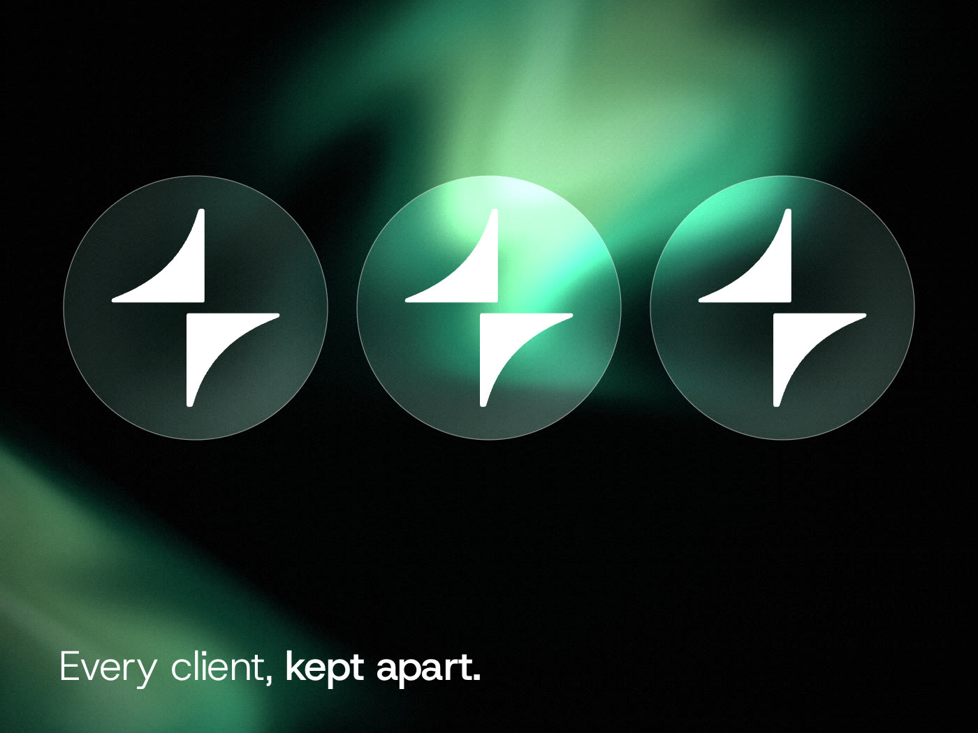
Three separate glass discs, each holding its own white spark. Words: Every client, kept apart.
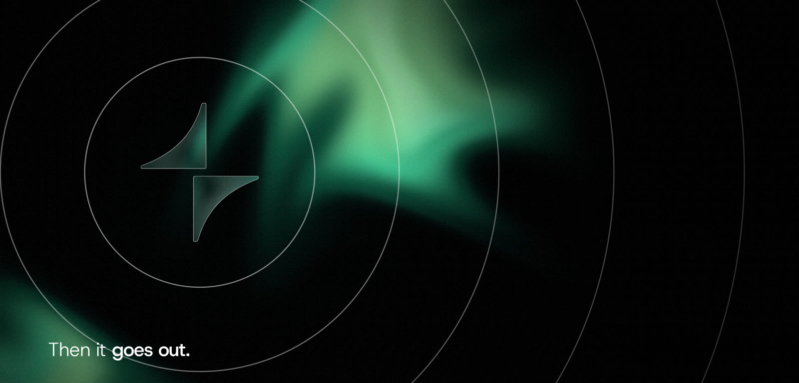
The whole glass spark sending rings outward across the light. Words: Then it goes out.

Graphic
pattern

The pattern is the liquid light drawn as lines: contours of the same flow that moves behind the glass in the imagery and the logo motion. It adds no new shape and tiles without a seam. One line may carry the mint, never more.
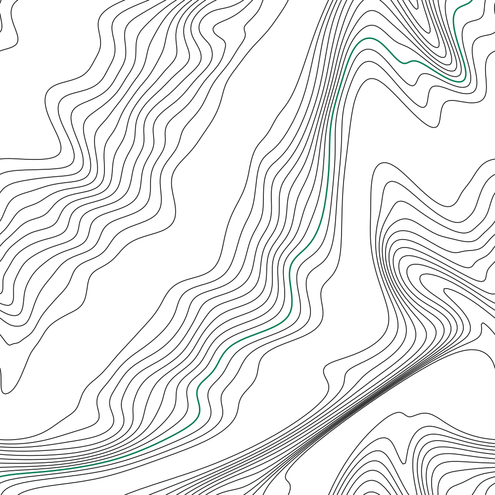
Unit
One 1000 × 1000 tile, seamless both ways
Scale
Tile at 25–100 % of the layout width; hairlines stay hairline
Colour
Ink on white or white on black, one mint line

Pattern
system

One pattern, three colourways. Scale the tile, never the stroke. Use it where a surface needs texture but no picture; never behind body text.
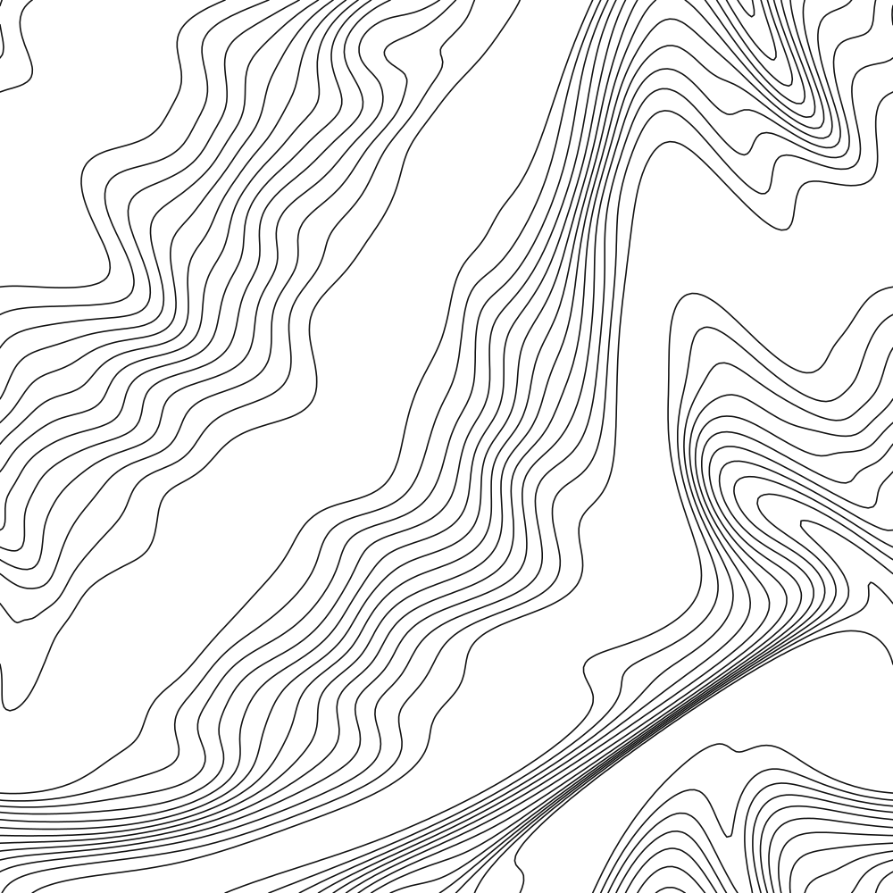
On black
Covers, packaging, large walls
On paper
Social, banners, slides
On mint deep
Merchandise, print edges

Motion

Motion explains, it does not decorate. Words rise into place line by line; the spark’s halves arrive one after the other and lock. Everything moves with one ease and then stops completely.

Ease
cubic-bezier(0.16, 1, 0.3, 1)
Timing
Text 900 ms, 55 ms per word · logo lock 480 ms
Reduced
prefers-reduced-motion shows the final frame only
Films
Two 5 s films: the approval story and the liquid-light motion; 1920 × 1080 and 1080 × 1080

AI works. People approve.

Text · words rise from a mask, one ease, then hold

07

Applications

Every application is built from the same few parts: the lockup, one headline, one image, mark or pattern.

Social media
creatives

Three post types share one frame: a headline of six words or fewer, the lockup bottom left, and a single image, mark or pattern. Copy states what keyAI does; it never claims numbers we have not measured.

Format
1080 × 1350 (4 : 5)
Margins
7 % of the width on every side
Types
Photo · Mark · Pattern
keyAI···

AI departments do the work.

keyAI
keyAI···

Nothing goes out unapproved.

keyAI
keyAI···

Marketing first. Sales next.

keyAI

Page
banners

Profile headers carry the promise, not the logo; the avatar already shows the mark. Keep text in the right half so the avatar never covers it, and use the Flow pattern on the left.

Company page
1128 × 191 · light profile
Profile header
1500 × 500 · dark profile
Avatar
Mark at 56 % of the square

The AI operating system for your company.

keyAI

AI departments do the work. Your team approves everything that goes out. · Software

FollowVisit website
HomeAboutPostsJobs

Your team approves everything that goes out.

keyAI

ai.keynexion.io

Follow

Web
and app

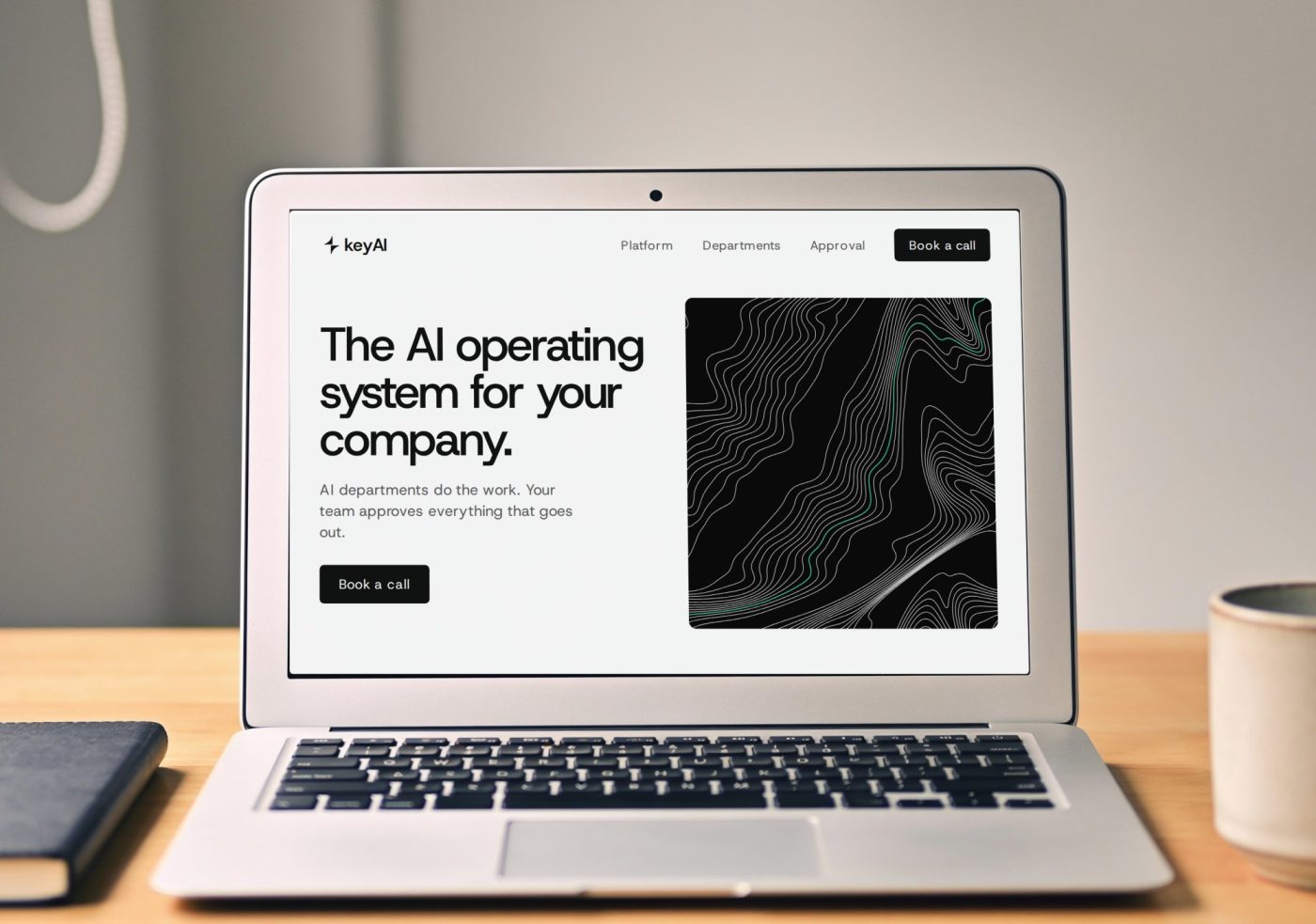
On screens the identity is mostly white space and one strong headline. Mint appears only at the approval step: the Approve button and the approved state.

Icon
Mark on black, 58 % of the tile
Favicon
Mark only, 16 and 32 px
Accent
Approve action and approved state only
keyAI · AI operating system

The AI operating system for your company.

AI departments do the work. Your team approves everything that goes out.

Book a call
keyAIToday
Drafts waiting for you
Marketing · Instagram postAutumn launch post, draft 2
EditApprove
Approved by you · 09:12Weekly report draft

Business
cards

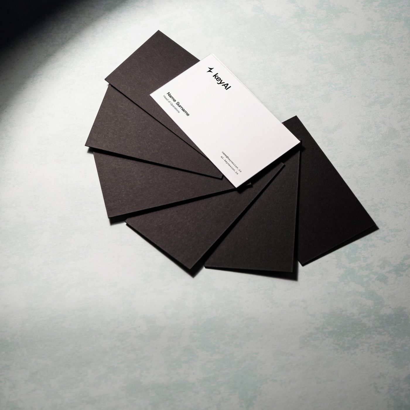
Front: black, the lockup and the address, with the mark cropped large in near-black. Back: white, the person, and a single mint mark. Details shown are a sample.

Size
85 × 55 mm, 4 mm bleed
Stock
Uncoated, 400 gsm or heavier
Type
Name 13 pt · role 8 pt · mono 7 pt

Name Surname

Head of Marketing

name@keynexion.io
ai.keynexion.io

keyAI ai.keynexion.io

Stationery

Uncoated paper, white or black. The lockup sits top left and small; the spark goes large only on covers. The approver’s badge is the one place mint is printed on paper: the approved bar.
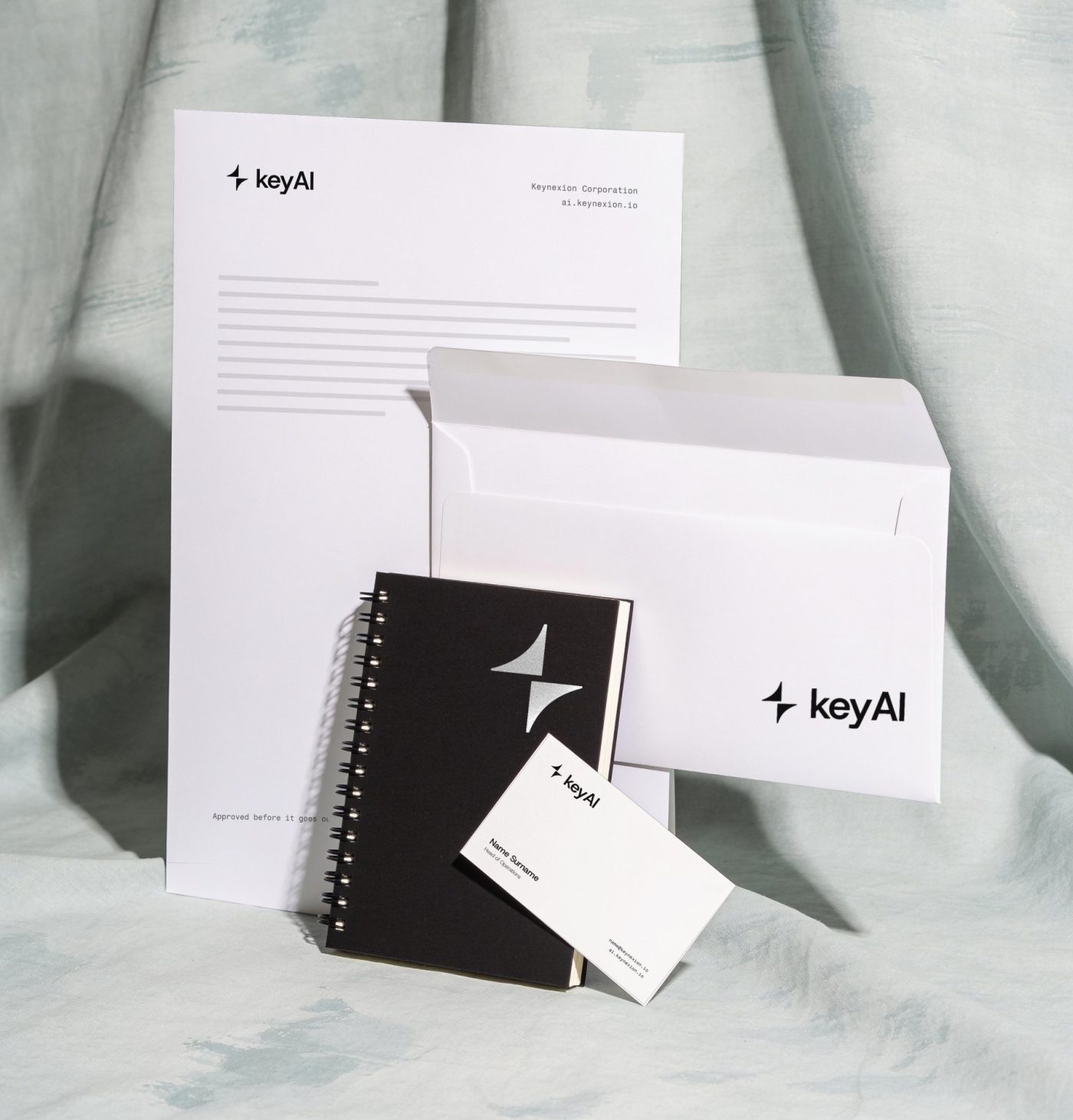
Letterhead
A4, lockup 30 mm wide, 18 mm margins
Cards
85 × 55 mm, 400 gsm uncoated
Badge
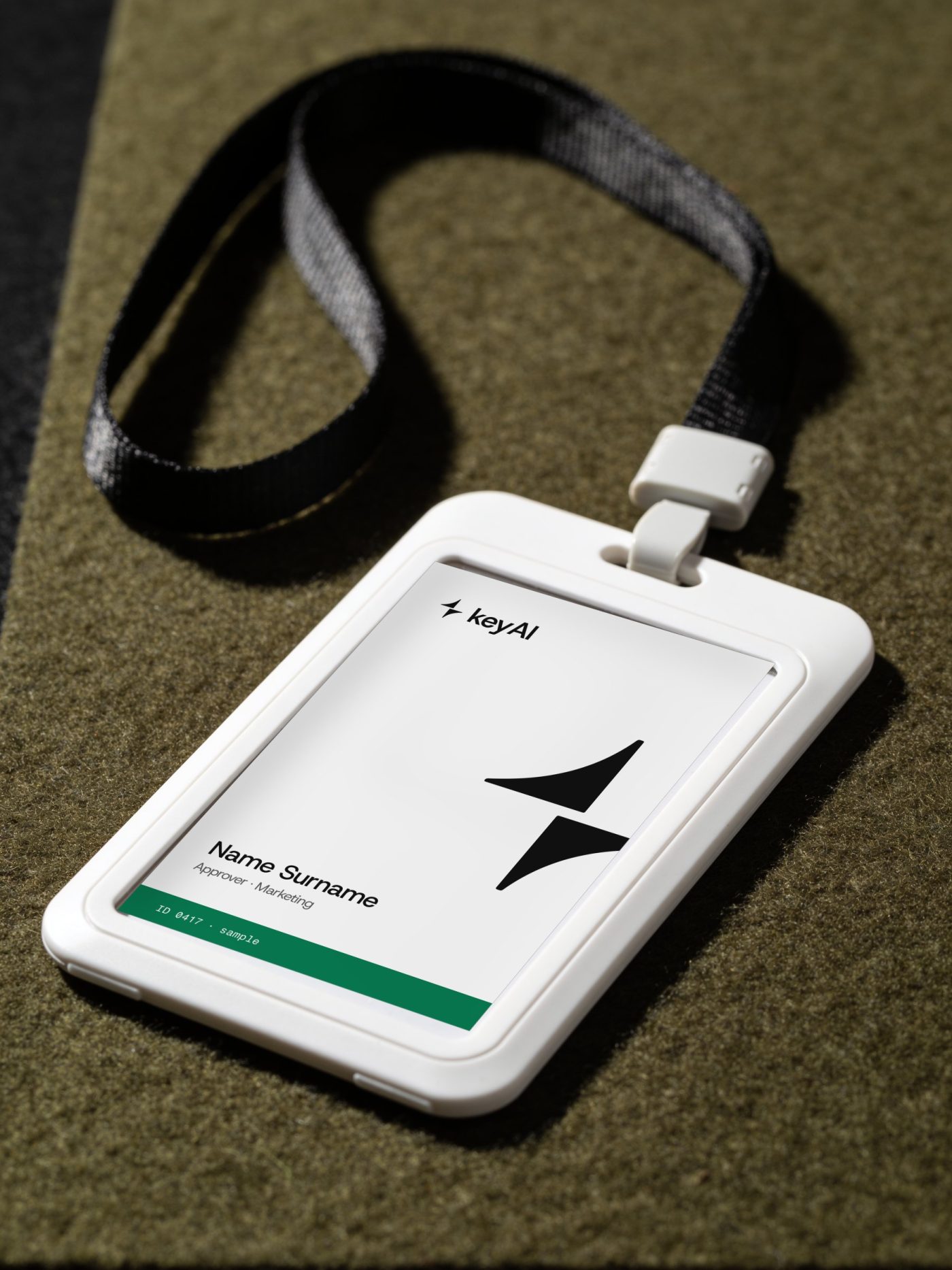
54 × 86 mm, mint bar = approver
Letterhead, envelope, black notebook and business card with the keyAI logo on a pale mint backdrop
Fan of black business cards with one white keyAI card on top
White ID badge with the keyAI logo and a mint approver bar on a black lanyard

Packaging
and devices

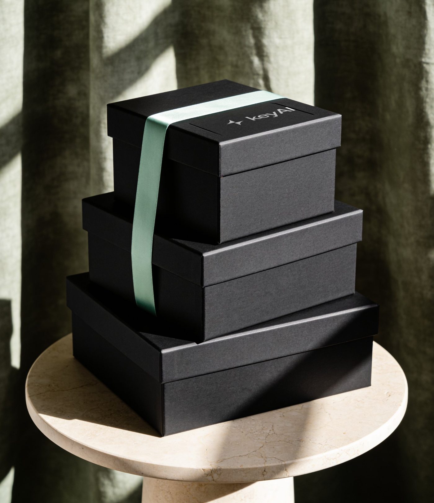
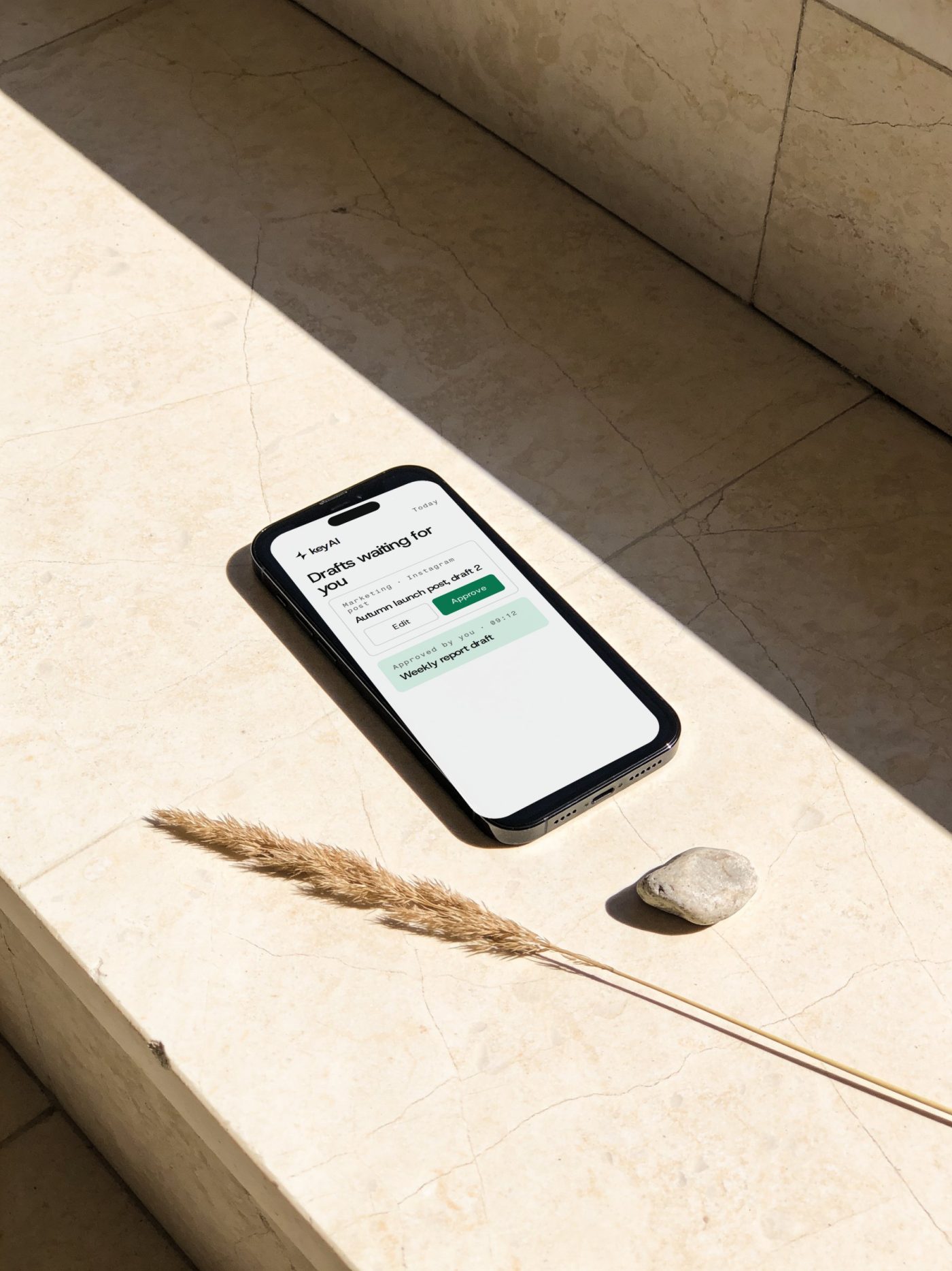
Boxes are matte black with the lockup in white on the lid and one mint ribbon. On screens the identity is white space and one strong line; mint only marks the approval step.
Box
Rigid, matte black board, white print, mint satin ribbon
Screens
Same layouts as “Web and app”, shown in place
Three stacked matte black gift boxes with the white keyAI lockup and a mint ribbon
Phone on travertine showing the keyAI approval screen
Laptop on an oak desk showing the keyAI website

Signage

Reception wall: the primary lockup in matte black, 1.2 m wide, its centre at a standing visitor’s eye line. No light box and no glow indoors.
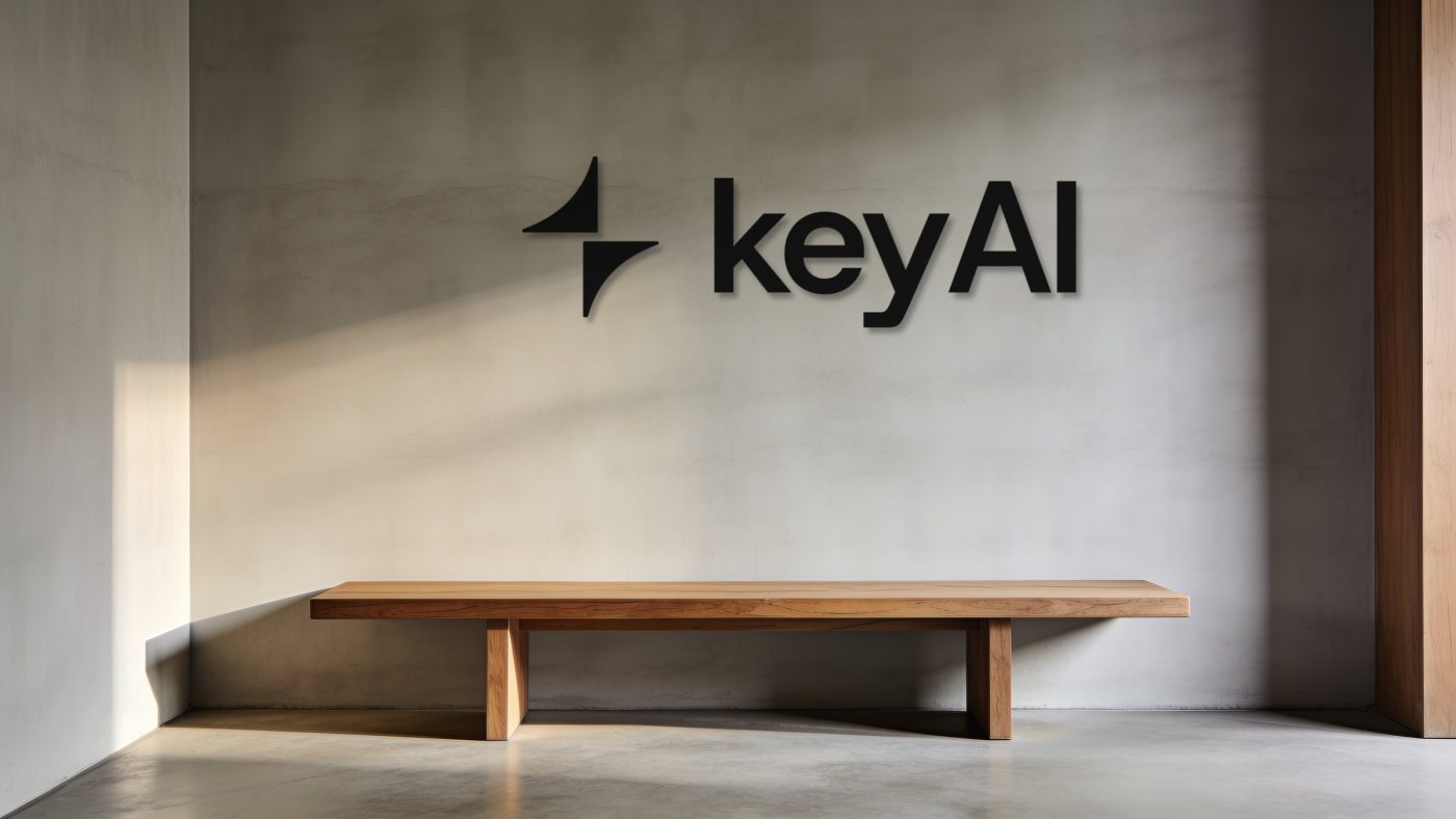
Calm reception with a matte black keyAI lockup on a grey plaster wall above an oak bench

Outdoor

One message of at most eight words, readable in three seconds. Day posters are black with the spark large and cropped, one phrase in glow. Night lightboxes are deep green with a glow spark.
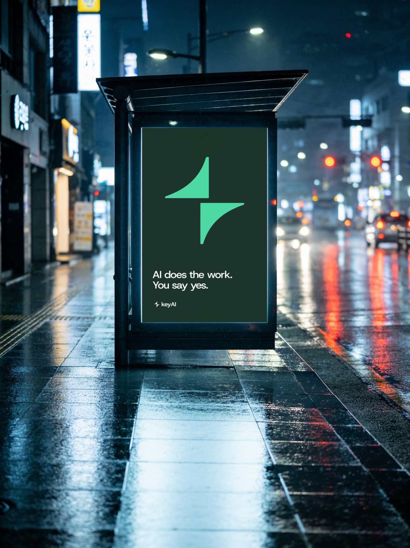
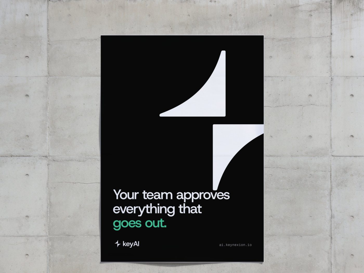
Lightbox
1185 × 1750 mm bus shelter
Poster
500 × 700 mm paste-up
Copy
Messaging layers 2–3 only
Bus shelter lightbox at night in Seoul with a deep green keyAI poster
Black keyAI poster pasted on a concrete wall

Merch­andise

Merchandise is quiet: black goods, one white print, either the lockup small at the chest or the mark alone. One glow piece per set, the pin, never the garment.
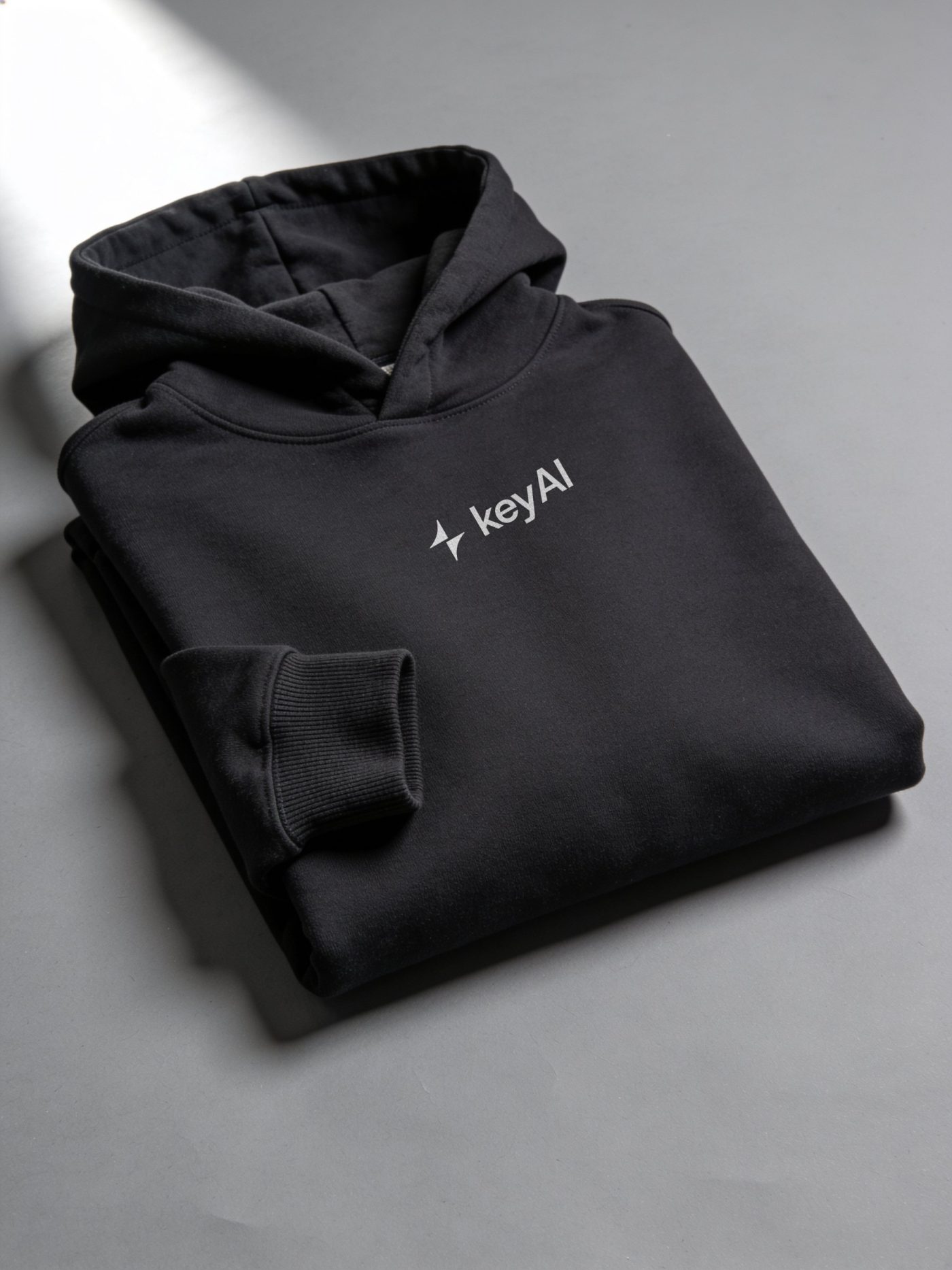
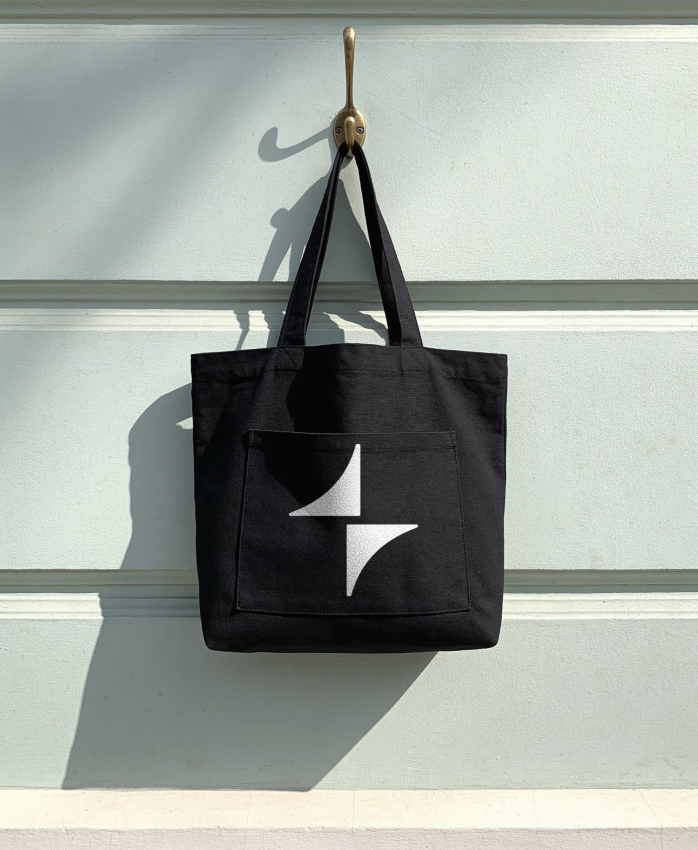
Print
One colour, white on black, water-based
Sizes
Chest lockup 80 mm · tote mark 120 mm · cap mark 45 mm
Accent
One glow item per set
Folded black hoodie with a small white keyAI chest lockup
Black canvas tote on a brass hook with the white spark on its pocket
Black cap with a small white spark on a stone stand
Four enamel pins with the spark, one in glow green

Logo
development

The spark stays: it is the asset people already know. What we develop is the system around it, as the strongest AI brands did. Four directions, one page each. None of them redraws the mark.

Finding
Four-point sparkles became the generic AI icon; users do not read them as AI (NN/g, 2024). Google counted about 100 variants (Google Design).
So
keyAI owns the two halves and the approval story, not the star.
Pick
A + B + C as logo system 1.1 · D for wide formats only
  • Anthropic · Geist: one warm colour, an irregular burst, no tech tropes
  • OpenAI · 2025: Blossom refined, not replaced; own typeface
  • Microsoft Copilot · two shapes, one silhouette; motion states
  • Linear · logomark plus a chip icon container
  • Runway · written minimum size, mark and word never side by side
  • Perplexity · Smith & Diction: asterisk plus cursor, built from its own story

A · Refine

Keep every shape and fix the relationships. The gap between spark and word becomes a rule taken from the letters, the loose y–A pair is closed, and small sizes get their own spacing. OpenAI and Vercel did the same: refine, don’t redraw.

Gap
Adopted in 1.2 as ½ cap height = 0.35 em (was 0.61 em)
Kerning
y–A −40 units; tracking stays −3.5 %
Mark
Unchanged: 1.45 × cap height, centred on the cap height
Small
Below 24 px: tracking 0, gap 0.45 em
Before · 0.61 em
0.61 em baselinecap height
1.2 · ½x = 0.35 em
0.35 em = ½x
keyAI

1.2 · 24 px

keyAI

Kerned · 24 px

keyAI

1.2 · 14 px

keyAI

Small cut · 14 px

B · Approval
motion

The two halves become the product’s state light: apart while AI works, closing while a draft waits, locked the moment a person approves. Rigid moves only. The shapes never bend, so every frame is still the logo.

States
Working · Waiting · Approved
Move
Along the 45° diagonal, at most 0.6 q apart
Ease
cubic-bezier(0.16, 1, 0.3, 1), 480 ms to lock
Precedent
Copilot: two forms, one silhouette (Microsoft Design)
Working
Drafting · Instagram post
Waiting
Waiting for you
Approved
Approved by you · 09:12

C · App icon

The spark sits in one rounded-square container. It gives the mark a fixed shape for app icons, avatars, favicons and goods, as Linear’s chip does. The icon is where approvals arrive: a draft is ready, a person approves it.

Shape
Rounded square, radius 22 %; top face inset 7 % sides, 4 % top, 12 % bottom
Mark
50 % of the top face height
Colours
Ink · white · mint only for “approved”
Check
Test against the plain mark at 16 px before adopting

keyAInow

Weekly sales report is ready for your approval.

ApproveReview

D · Bracket

For wide formats only: the halves open and the name stands between them, the work on the left and the approval on the right. A signature for banners, signage and video end cards. Never small, never in the app.

Use
Width at least 6 × height: banners, signage, end cards
Halves
Cap height tall, 0.3 cap from the word
Never
Under 240 px wide, or on the same page as the primary lockup

AI works.
People approve.

Guide
versions

This book is versioned like software. Every change gets a number, a date, what changed and who decided. The newest version wins; older ones stay readable.

Numbers
Major.minor: a logo change is major, new pages are minor
Decides
The CEO picks; Keynexion brand keeps the files
Next
2.0 once a logo direction is picked (a logo change is major)
  1. 1.219 Oct 2026 · revision

    Restructured after the Bolt brand guidelines: section openers, a section index on every page, contents by section, logo development moved to the appendix. Added logo usage, co-branding, colour in type, expressive and recessive type. Changed the lockup gap to ½ cap height (0.35 em, was 0.61 em), the image ground under the white logo to a drawn mathematical field, small captions removed, body text tracking opened.

  2. 1.1.218 Oct 2026 · revision

    Rebuilt brand imagery, a background loop and a second logo motion in liquid light under the glass spark; the Flow pattern replaces the spark tilings. Added English and Korean editions. Renamed direction C to App icon.

  3. 1.118 Oct 2026 · proposal

    Added verbal identity, messaging, logo development A–D, logo versions, motion and the logo film, stationery, packaging, signage, outdoor and this page. Replaced stock photos with keyAI images and flat drawings with studio mock-ups; new Colourways background; text animation.

  4. 1.018 Oct 2026 · first pass

    26 pages from one logo: idea, logo, type, colour, imagery, patterns and applications.

Thank you. Questions about using the identity go to the contact on the right.
Web
ai.keynexion.io
Company
Keynexion Corporation Inc.
Version
1.2 · October 2026
Page
keyAI
Back to site